5 Best Squarespace Templates for Photographers (2026)
So here's the thing about being a photographer online: your website is your portfolio. It's not a place that shows your work. To a potential client, it basically is your work. And people decide whether your photography is "worth it" in about three seconds of landing on your site, usually before they've read a single word. It’s all about the visuals!
That's a lot of pressure on a website. The good news? You don't have to build something custom and expensive to make you look good. A well-chosen Squarespace template does most of the heavy lifting. You just need to pick one that's actually optimized for photographers.
So let's talk about what a photographer's site actually needs, the five templates I'd point you toward, and a few gallery tricks that make your images look their best.
What a photographer's website actually needs
Before we get to specific templates, here's what most "best templates" lists skip: pretty isn't the point. Your work is already pretty. The template's job is to frame it and convert it. For a photographer, that comes down to four things:
1. A gallery-first layout. Your images should be the biggest thing on the page: full-width, high-impact, room to breathe between pieces. If a template makes your photos small or crowds them with text and buttons, keep looking. The design should get out of the way and let your work be the whole show.
2. An investment (pricing) page. This is the one photographers avoid, and it costs them. You don't have to list every number, but you need a page that talks about your packages and what it's like to work with you. It filters out the wrong clients before they hit your inbox, and it makes the right ones feel confident reaching out.
3. A clear inquiry flow. Booking a photographer is emotional and high-trust. A wedding, a family milestone, a brand a client has poured themselves into. The path from "I love this" to "let me reach out" has to be clear and simple, with zero friction. One obvious contact or inquiry button, everywhere it matters.
4. An about page with your face on it. People don't just book photos. They book you for a few hours of one of the most important days of their life. They want to see who they're trusting. A strong about page with a real photo of you does more than you'd think! Also, smile. People want to know that they can smile easily with you as their photographer!
If a template makes those four things easy, it's a real contender. If it buries your galleries or has nowhere natural to talk about pricing, it'll fight you forever.
The 5 best Squarespace templates for photographers
Here's where I'd actually start, depending on where you are.
1. Amour — my pick for wedding & portrait photographers
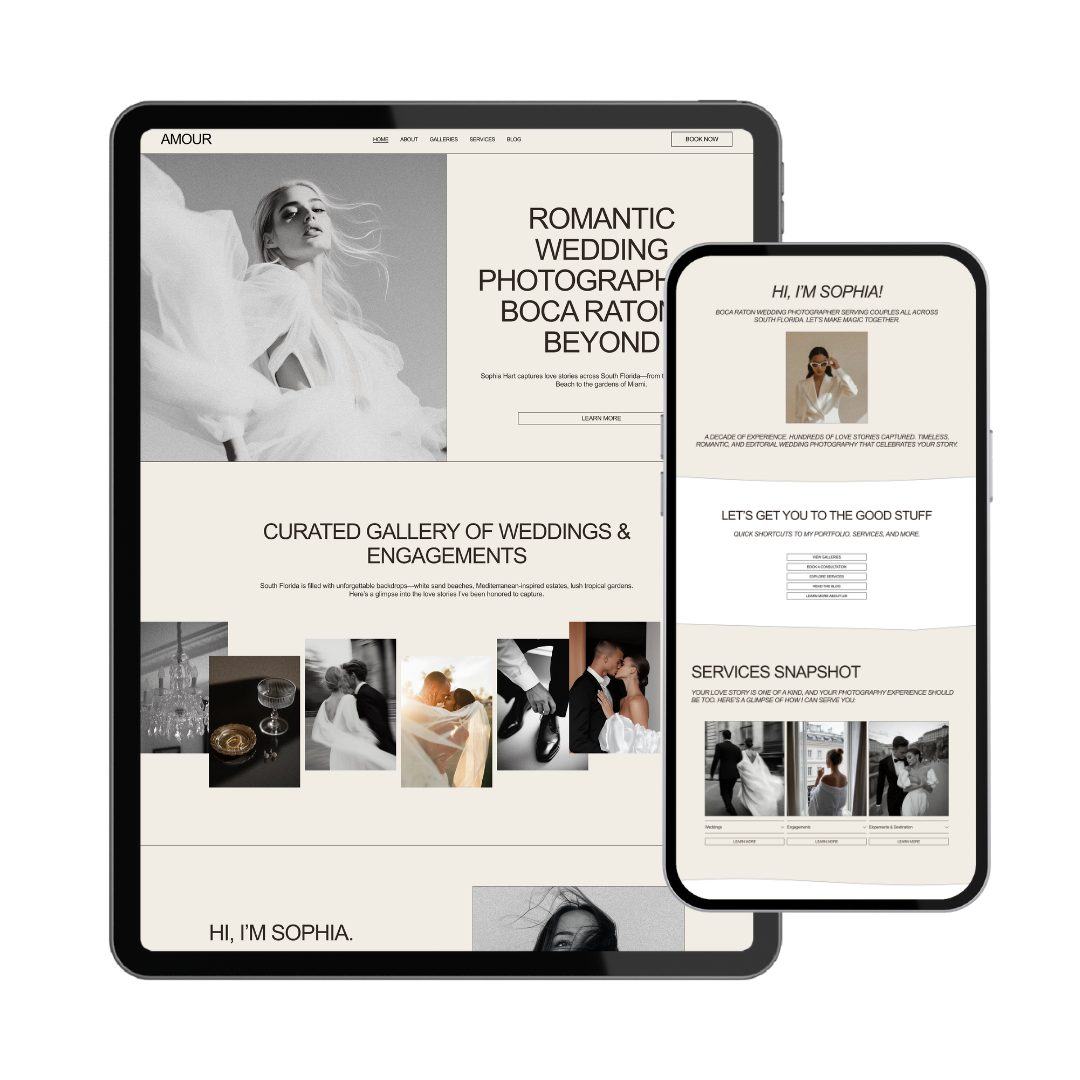
This one's mine, and I built it specifically for this. Amour is romantic, elegant, and fine-art: soft type, timeless layouts, and galleries designed to make your images feel like the art they are. It's for the photographer whose work is warm and editorial, who wants a site that feels as intentional and beautiful as the photos on it.
It's got everything on that must-have list already built in: gallery-first pages, a proper investment page, a clean inquiry flow, and an about page made to build trust. You're customizing it to feel like you, not constructing it from scratch. (You can find it in the shop - link at the bottom.)
(Psst… if your style leans dark, moody, and editorial instead of soft and romantic, I've got a bold counterpart to Amour releasing this fall. Keep an eye out.)
2. A Squarespace built-in portfolio template
If you're just testing the waters and don't want to spend anything yet, Squarespace's own free portfolio templates are a fine starting point. They're clean and gallery-friendly. The trade-off: they're generic. Thousands of photographers use them exactly as-is, so your site ends up looking like everyone else's. Great for a placeholder, less great for standing out and charging what you're worth.
3. A minimal one-page template
If you're brand new, don't have a huge body of work yet, or mostly book through Instagram, a single-page template (landing page) is honestly all you need. One beautiful scrolling page: a hero gallery, a short about, your packages, and a contact form. Beats a sprawling five-page site that feels empty. You can always expand later as your portfolio and reviews grow.
4. A portfolio-forward, gallery-heavy template
If you shoot high volume… lots of sessions, lots of categories (weddings, portraits, brand, lifestyle), you'll want a template built to organize multiple galleries cleanly. Look for one with easy category navigation so a bride isn't scrolling past your newborn sessions to find wedding work. Organization is the whole game here.
5. A semi-custom (done-for-you) template
This isn't a different template so much as a different path. If the tech side makes you want to close the laptop, you buy a template like Amour and have it customized for you — your images, your words, your brand — and handed back ready to launch. You spend your hours shooting and editing, not fighting Squarespace. (More on that below.)
The thread across all five: let the work lead, make pricing and inquiry easy, and don't try to look like everyone else.
A few gallery display tips (that make a big difference)
Your template matters, but how you load your galleries matters just as much. A few quick things I'd tell any photographer:
Don't upload everything. The instinct is to show all your best shots — but a gallery of 200 images overwhelms people and slows your site to a crawl. Curate hard. A tight gallery of your 20 strongest images sells better than 200 good ones.
Optimize your file sizes. Big, unoptimized images are the #1 reason photography sites load slowly — and a slow site loses people before your work even appears. Export web-sized versions (Squarespace handles a lot, but start smaller than full-res).
Group by category. If you shoot more than one thing, separate your galleries so each type of client can find their version of your work fast. A wedding client wants to see weddings, immediately.
Lead with your absolute best. The first two or three images someone sees decide whether they keep scrolling. Front-load your strongest, most swoon-worthy shots — not chronologically, not by session, just best first.
Template or done-for-you: which is right for you?
Here's the honest breakdown.
A template is right for you if you're comfortable learning Squarespace, you've got a little time to swap in your images and copy, and you'd rather save money than hand it off. A good template gets you a professional photography site for the price of a single session. You've got this.
Done-for-you is right for you if you'd rather spend your limited hours behind the camera and in the editing suite than wrestling with a website. In that case, I customize the whole thing for you — your galleries, your brand, your copy — and hand it back ready to launch in 2–4 weeks.
Either way, you're not starting from a blank screen. That's the point.
The bottom line
Your photography deserves a website that treats it like art. Because for your clients, that site is the art until they book you. You don't need custom. You don't need expensive. You need gallery-first, clear on pricing, and easy to inquire from — and you need it live.
If you want a template built specifically for wedding and portrait photographers, Amour is in the shop, starting at $69 for a link-in-bio, $89 for a landing page, or $189 for the full site. And if you'd rather hand the whole thing off, here's how we can work together — customized sites launch in 2–4 weeks.
Either way: let's get your work the website it deserves.