The Best Squarespace Font Pairings for 2025 (And How to Use Them Like a Pro)
Fonts and colors do way more than just “make it pretty.”
They instantly communicate your brand personality, set the tone for your business, and create consistency across your website—without saying a word. If you’ve ever looked at a site and thought, Wow, everything about this just feels right, there’s a good chance the designer intentionally chose that specific font pairing and color palette.
So whether you’re customizing one of my Squarespace templates or building your site from scratch, this post will give you all the inspiration (and strategy!) you need to confidently pick fonts and colors that reflect your brand in 2025.
If you want a website that feels polished, strategic, and actually ready to launch… Apply for my Template Customization 2-Week Sprint — limited spots available for 2026.
Why Fonts + Colors Matter More Than You Think
Fonts and colors aren’t just design choices—they’re emotional cues. The right combination can make your brand feel elevated, approachable, bold, peaceful, luxe... or whatever you’re business is specifically aiming to communicate.
On the flip side, a mismatch can make your site feel disjointed and confusing. For example, you wouldn’t expect to see a playful font pairing and bright youthful colors for a real estate company or doctor’s office.
That’s why I put so much intention into the design of my templates, and why you should too.
How I Pick Font Pairings
There are thousands of fonts out there, but not all of them play well together. I look for contrast, clarity, and a complementary tone when choosing a pairing. Here’s what I consider:
Serif vs. Sans Serif: Serif fonts (with decorative strokes) often feel classic or editorial, while sans-serif fonts are sleek, modern, and versatile.
Hierarchy: Your heading font should grab attention, while your body font should be readable and clean.
Tone: Fonts carry a vibe. Romantic? Modern? Edgy? Make sure yours aligns with your brand personality.
🎨 My Top Squarespace Font Pairings for 2025
Here are my favorite font combinations right now—organized by style—perfect for customizing your Squarespace site.
Serif Font Pairings
1.Freight Display Pro + Sofia Pro
Vibe: Editorial, luxe, polished
Best For: Coaches, bloggers, or creatives wanting a magazine-inspired look
Why it works: Freight Display has high contrast and elegance, while Sofia Pro brings a soft modern balance.

2. Cormorant Garamond + Work Sans
Vibe: Elevated, approachable, modern-classic
Best For: Coaches, creatives, consultants who want sophistication without stiffness
Why it works: Cormorant Garamond has timeless elegance with a softer edge than Tiempos, while Work Sans balances it out with clean readability for body copy.

Sans Serif Font Pairings
Helvetica Neue + Arial
Vibe: Minimal, contemporary, timeless
Best For: Branding studios, photographers, creatives
Why it works: Helvetica Neue is bold but not overpowering. Paired with the classic Arial, it keeps the focus on your content.

2. Futura PT + Proxima Nova
Vibe: Bold, geometric, timeless
Best For: Architecture firms, tech startups, modern agencies
Why it works: Futura PT is geometric and attention-grabbing for headlines, while Proxima Nova offers a neutral, structured balance in body text. Together they feel modern yet enduring.

Script Font Pairings
Great Vibes + Montserrat
Vibe: Elegant, stylish, elevated
Best For: Wedding planners, event stylists, luxury service providers
Why it works: Great Vibes delivers flowing sophistication for headings or accents, while Montserrat balances it with geometric clarity for body text and CTAs.

2. Pacifico + Raleway
Vibe: Fun, bold, creative
Best For: Makers, artists, small boutique shops
Why it works: Pacifico’s playful, rounded script has tons of personality, and pairing it with the sleek minimalism of Raleway ensures the design doesn’t feel chaotic.

Display Font Pairings
Playfair Display + Playfair Display
Vibe: Sophisticated, editorial, timeless
Best For: Blogs, personal brands, creative entrepreneurs who want a polished magazine-style feel
Why it works: Using different weights and styles of Playfair Display (such as bold for headings and regular or italic for body text) creates natural hierarchy while maintaining a cohesive, elegant look. It’s a simple pairing that feels high-end without the need for multiple fonts.

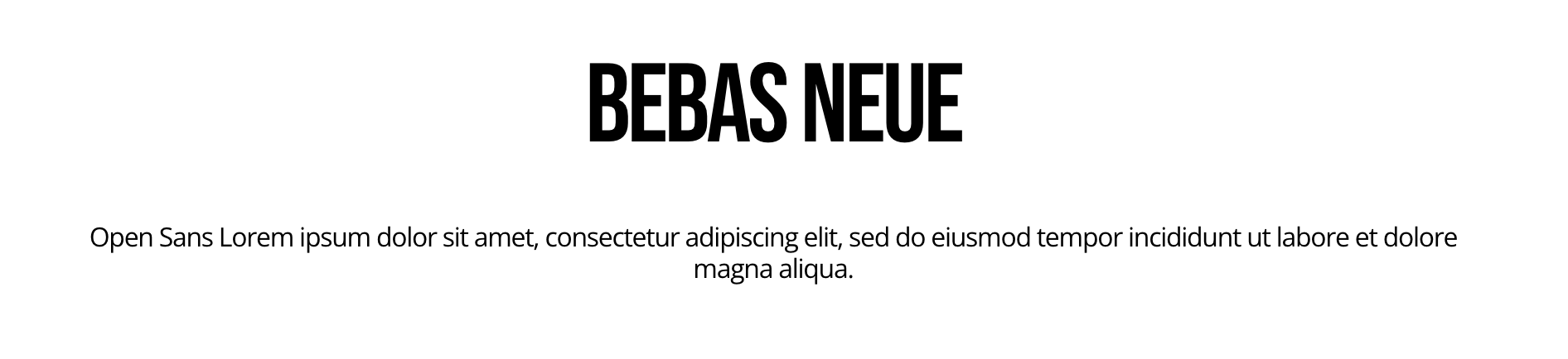
2. Bebas Neue + Open Sans
Vibe: Strong, confident, minimal
Best For: Agencies, personal brands, portfolios, fitness or lifestyle businesses
Why it works: Bebas Neue’s all-caps style makes a bold visual impact in headings, while Open Sans keeps things clean and approachable in supporting text.
🎨 How I Choose Color Palettes
Fonts are half the battle—color is the other. I start with brand moodboards or visual inspiration (hello, Pinterest) and pull from nature, interiors, fashion, and packaging design. Then, I make sure every color has a purpose: primary, accent, neutral, and call-to-action.
3 Website Color Palettes I’m Loving Right Now
1. Earthy Calm
#927E6A(Warm taupe)#C7BAAC(Dusty beige)#FAF8F5(Cream)Vibe: Grounded, nurturing, natural
Best For: Wellness brands, lifestyle blogs, slow-living creatives
2. Bold Minimal
#1E1E1E(Deep charcoal)#FFFFFF(White)#F5A623(Vibrant amber)Vibe: Confident, energetic, high contrast
Best For: Agencies, personal brands, modern creatives
3. Soft Luxe
#B9B0C9(Dusty lavender)#EDE9F3(Pale lilac)#FDFDFD(Off white)Vibe: Elegant, calm, feminine
Best For: Designers, coaches, service providers
🎨 Want palettes like this baked into your website? Browse my template collection—every one includes designer-curated colors.
How to Customize Fonts + Colors in Squarespace
Inside Squarespace, it’s all under Design > Site Styles.
Fonts: Choose or adjust pairings in “Fonts,” then preview how each font looks for Headings, Paragraphs, and Buttons. Don’t forget to check out all of the options under fonts to customize even further! View pictures below to see what this looks like.
Colors: Head to “Colors” to apply and test your palette.
Advanced: Use custom CSS for extra tweaks (like tracking, font weight, or unique pairings not offered by default).


Final Thoughts: Fonts + Colors Are Your Brand's First Impression
Choosing fonts and colors isn’t just about aesthetics—it’s about telling your story visually. Your Squarespace site should feel cohesive, intentional, and aligned with your personality and purpose.
So whether you're just starting out or giving your site a refresh, take the time to choose combinations that elevate your message and resonate with your dream clients.
💻 Ready to launch with style?
Get one of my Squarespace templates with curated font pairings + color palettes built right in. You’ll save hours and launch with confidence.


